A quick overview
How we helped
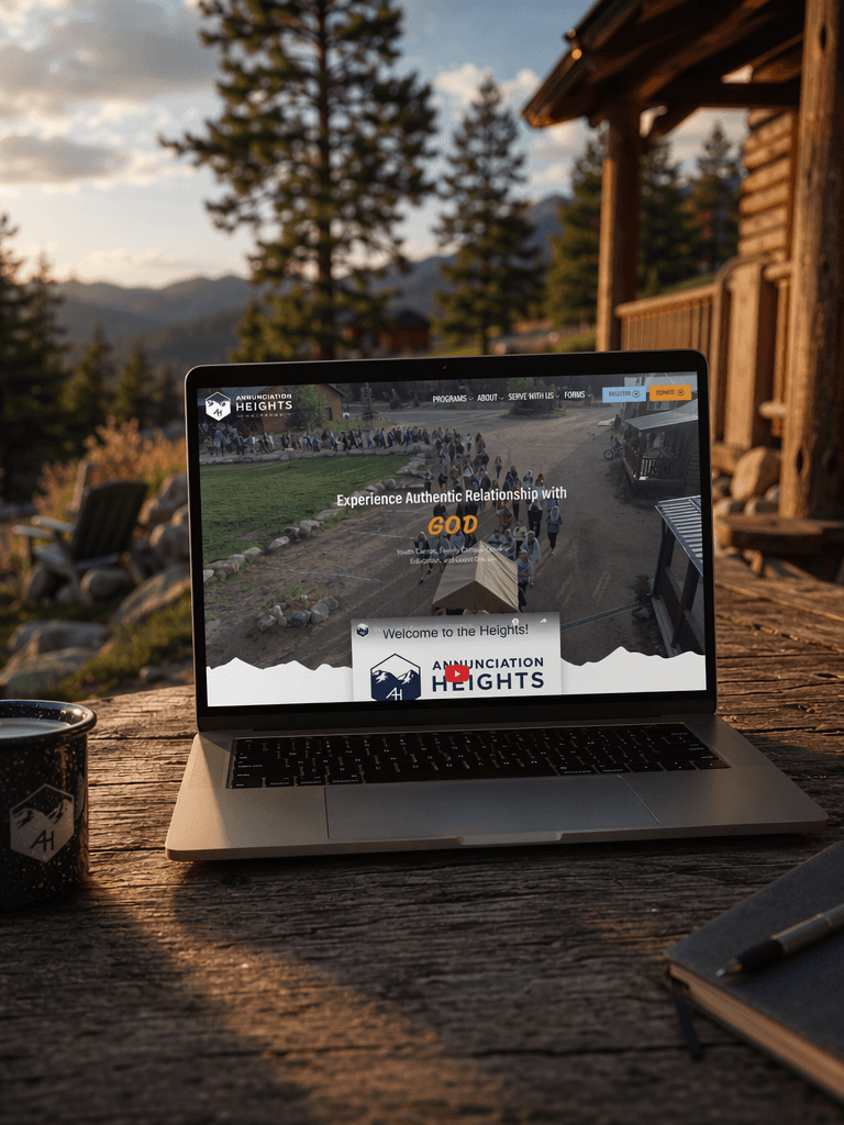
We partnered with Annunciation Heights to build a new website and bring greater clarity to its visual identity. The original logo had multiple shapes and no clear usage direction, so we aligned the brand around one clear geometric form—a hexagon—and carried that shape through the website and supporting materials.
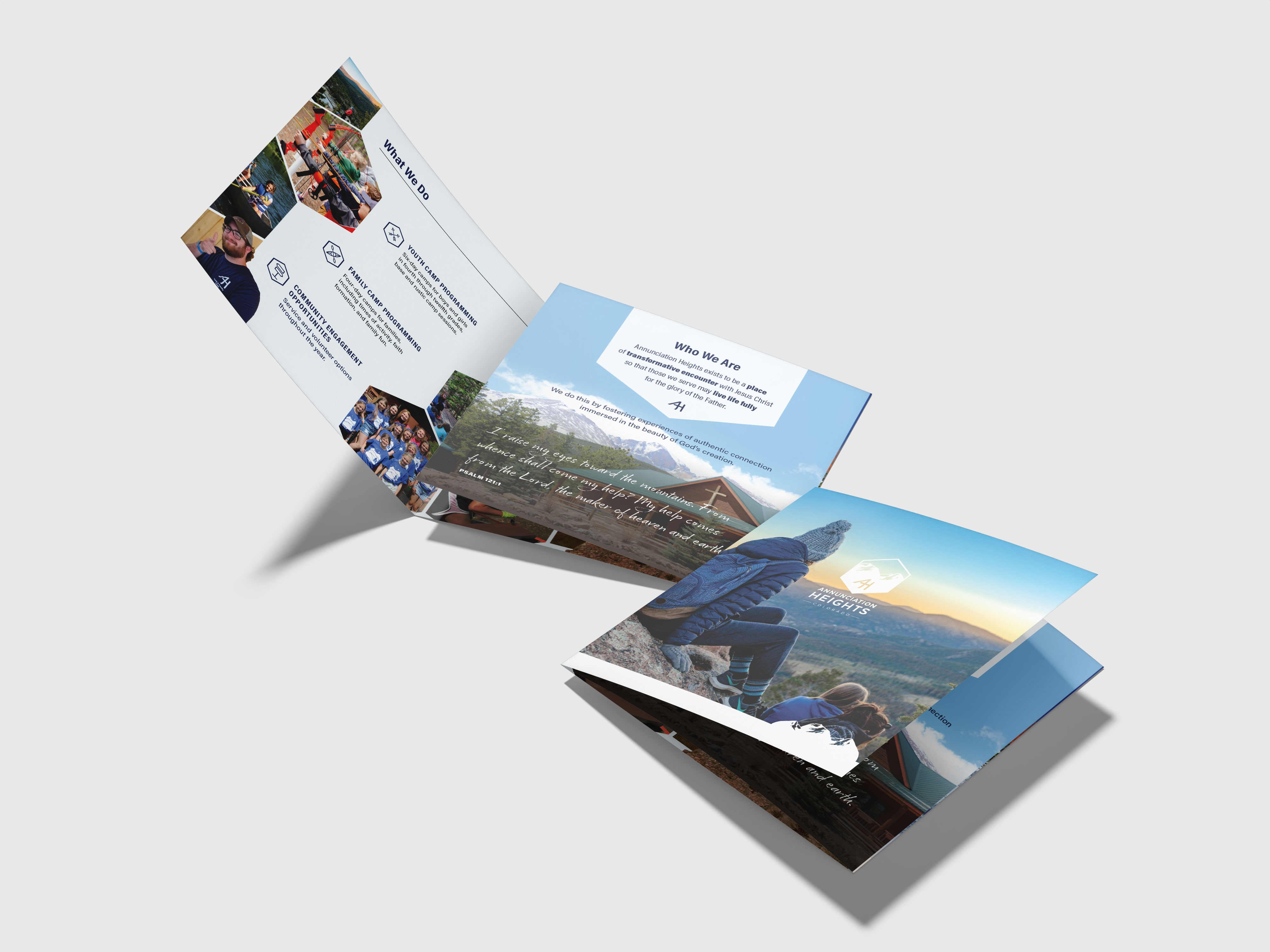
The hexagon became a flexible foundation for distinct sub-brands across family camps, group retreats, school learning, and other programs, giving each activity its own expression while keeping the organization recognizable as one brand.
We also created practical marketing materials, including a brochure, flyers, and other marketing materials, so the refreshed system could work consistently across digital and print touchpoints.
Scope
Website Design
Brand Identity
Design
Print
Website
↗
Work
Annunciation Heights
Annunciation Heights is a Catholic youth and family camp in the Colorado Rockies offering camps, outdoor education, retreats, and missionary formation.